Contributors

Monday, 9 May 2011

Q7 : LOOKING BACK AT THE PRELIMINARY TASK, WHAT DO YOU FEEL YOU HAVE LEARNT IN THE PROGRESSION FROM IT TO A FULL PRODUCT ?

My preliminary task was to create the front cover and contents page of a college magazine. In that task I had to use the editing software which was Adobe Photoshop CS3 and I took my images using a Canon EOS 400 D. All these pieces of equipment and software allowed for me to produce my final product. I found the task quite challenging as I was unaware as to how I would use the editing software of Photoshop and I had taken images with much more simple cameras before but I had never used anything like a Canon. Getting used to using Photoshop was fairly hard and I can say taking images with the camera was a lot easier. In the end I took some decent images for my college magazine and found that the instructions that I had received from my teacher proved very helpful.
Since doing that task, I believe that the development of my skills has done so by far and my organisations skills could have been done a lot better. Keeping to time and sticking to deadlines was not easy but in doing so I found that this task and the deadlines set made me more focused and allowed for me apply myself effectively. I found my models very easily as they were my friends and the locations where I took my images was on the college site making and giving more of a college and educational feel to my work. I took a wide range of images as it would allow for me to choose the ones I would prefer and like the most at a later stage.
In moving onto this task I learned how to set up cameras, link them to the flash and soft-box also being aware of the danger faced when doing it wrong. Also in doing this I learnt how helpful these pieces of equipment would be and how they would assist my final product. The use of a soft box and a circular reflector allowed for my images to finish with a more professional touch and it removes harsh shadows. Alongside lightening the subject it creates and almost fake light which makes and creates a smoother effect on the final image.
Making use of the camera has allowed for me to learn that how to set it and make use of a soft box, connecting it to the trigger, allowing me to take images correctly. I took all of my images in both portrait and landscape orientations allowing for there to be a diverse and wider range of images.
Not knowing how to previously use Adobe Photoshop made my final product even harder to create but the skills and knowledge I gained from my preliminary task made it easier for me. I used a range of tools from spot healing tool, surface blur and hue / saturation adjustments to make my photographs picture perfect. Also the brightening of my models and their clothes made it a lot easier for my photographs to come out in the way that they did. The magnetic lasso tool, allowed for me to put and easier way to cut out models and place them on alternate backgrounds. The use of the spot healing tools and surface blur, gave my models a clearer and more airbrushed look as it removed all of their previous imperfections allowing them to be left with almost perfect faces.
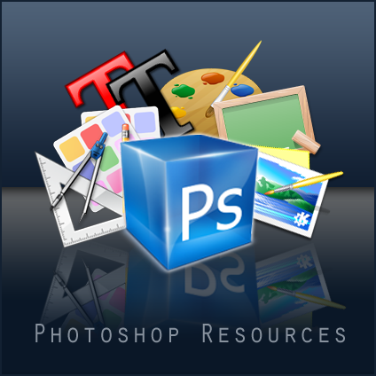
When actually making my magazine, I used a large variety of fonts from those already preloaded on the Photoshop system to some that I downloaded from font websites such as www.dafont.com.  The majority of fonts that I used were sans serif. This gives my magazine an effect that is more modern and unlike the magazine of , for example The Rolling Stones, a magazine that has been published for years and the font they have been using never changes of differs to those that he magazine began with. Using a large amount of fonts gave my magazine a larger variety and it gave it a more attractive and welcoming look. Making use of correct fonts is key in the creation of my final product as it will allow for a memorable image to be placed in the minds of my audience as they will know what magazine it is everywhere they go. My main masthead on the front of my magazine is a font from dafont.com called graffiti. It gave my work a rougher and rugged look as it is mostly based on an urban look on music but it has elements of other music genres as I looked at a wide range of magazines to influence my work. I had to use a very loud font which would alternate from that that I had used in my magazine.

Having different fonts used for my titles and articles is important so that my audience can easily differentiate my work. It also allows for it to be more unique and stand out better. I used different fonts from hand-written styles to military blocked writing to show a difference and a variety in my work. The handwritten style of font allowed for me to connect with my audience on an informal level, making them feel much more welcoming and inclusive with the magazine.

Sunday, 8 May 2011

Q6 : WHAT HAVE YOU LEARNT ABOUT TECHNOLOGIES FROM THE PROCESS OF CONSTRUCTING THIS PRODUCT ?

Q5 : HOW DID YOU ATTRACT / ADDRESS YOUR AUDIENCE ?

My magazine attracts my audience by having a large image of a female model on its front cover. She is posing with a microphone in her right hand , clicking with her left and a pair of dark sunglasses on her face. This is attractive as it welcomes the audience to look at my model and they can find out what she about in my magazine. It is a very visible image of a female 20 year old music artist. This allows for the medium of the target audience to be met, making it that there is an age relation to the audience.

She is wearing vintage but fashionable clothing from the popular retailers which is Topshop. This is due to the majority of the audience being at an age where their fashion senses are beginning to develop and one of the best selling retailers worldwide is Topshop, not just for clothing of an older age but mainly see in those who are 16-24 years old. Wearing brands from stores such as Topshop, Miss Selfridge, House of Fraser and New Look, makes for my audience, mainly concerning females for this issue, will allow for a wider amount of my target audience to be interested. Due to my magazine having a solid basis about fashion, technology and makeup, the portrayal of these three factors much come across in a strong manor so that the criteria for my target audience is filled.

Another way that i used to attract my target audience is through the way that i kept the focus on the female power in the music industry, specifically for this issue. Having a strong female focus meant that the majority of people who found it to be interesting will have a steady focus on one topic, being female power in the music industry throughout the magazine. This was achieved by making it that the female stories and images where the only things that i focused on. This was through the ways that i captured my photographs with the Canon EOS 7D, and my manipulation of my raw images in Adobe Photoshop CS3. The focus on music genres really does help as instead of looking at ranges of genres but focusing on those that received a great amount of feedback in my audience research.


The use of recognised artists on my front cover really enhanced the likelihood of my audience being interested in what they see. This is because having something that is recognisable with elements of new additions is very interesting and manages to catch the audiences eye very easily. For Example the use of names such as Jessie J, Rick Ross and Wale means that it will be something that my audience finds very happy to read and pay money to purchase. I know that my audience will find all of the listed artists interesting and there will be a likelihood that they have heard of them or listened to their music before, that is the main reason for choosing those names. I kept a broad use of names so that out of 10 - one will be recognised. Keeping my magazine fairly modern and contemporary so that it will be appealing to the eye as much as the content is as well. Including things about well known artists and competitions in the coverlines will mean that i am keeping to the form and style of my magazine structure.

Throughout my magazine product i used a range of sans serif fonts to keep to the modern look and structure of my work. This also works very well with the fonts that i downloaded from http://www.dafont.com/. Having a website to import fonts from makes it very easier to find letter and typefaces that suit the genre of music that i am attempting to achieve.

Including the use of sans serif fonts, i also downloaded handwriting type fonts from www.dafont.com as well. This allowed for there to be more of a personal approach to my work. Having wording that looks written in comparison to structured and stable words makes it much easier to for the audience to have a closer relationship to the editors of that specific article. ' YOUNG ABI'S : SCHOOL OF MAKEUP - TOP 10 TIPS FOR SUMMER' is one of my main coverlines that uses a handwritten type font. This is very important as young girls find that use of makeup and appearances very important so having a text that makes it look like it has been written by hand allows for there to be a connection from audience to editor, encouraging them to regularly purchase a magazine where they are able to trust the company, their advice and their content.


I used a simple an complimentary colour scheme, making it fairly easy to establish and something that worked very well together. My basic colours where orange, beige, red , brown , grey and black all stemmed from things that had been found in the image that was on my front cover, contents page and double page spread. This made it so that no outstanding colours were used, only things that had a previous inclusion with my product. Colour scheme plays an important role in the decision that some of the audience takes when looking to purchase and review a magazine. Making a the wrong decisions with colour schemes can affect the reception received from the public. Using colours that are worn and recognised by both genders allowed for there to be an equal amount of separation, with me not having to constantly refer to which colours work better with each gender. The colour scheme analysis spans over all my 3 products. My contents page is fairly simple in regards to it's layout. It is very structured with everything having it's designated place and it is straight forward and easy to understand. It being this clear means that my work isnt too busy and there is an ability to read everything fairly and easily as it is not too much to see at once.

Friday, 6 May 2011

Q4 : WHO WOUD BE THE AUDIENCE FOR YOUR MEDIA PRODUCT ?

MicCheck targets an international audience; but the main focus is on the British and possibly American audiences. This is because they are the main creators of female solo artists of today and for many years in the past. They are where other cultures and possible music genres look for inspiration and they are able to find it due to the range of talent that is found and produced.

I decided to target mainly those aged from 16 to 19 years of age because of the content of my magazine. It is inclusive of mainly fashion, music and makeup but it also touches on elements of technology and issues of today on it's blog page. These elements have been the cause for me modelling the female artist with a good fashion sense, use of make up and the micro phone to portray her musical skills.
 
Looking into ethnicity , i have targeted mainly those who are interested in the music genre's of hip hip and r&b. This is due to there being a large audience, especially in the age that i selected for those in my target market. Together my magazine attracts a large black audience but that doesn't dispute a Caucasian, Asian and Hispanic audience being attracted by the content of the magazine.

My magazine targets mainly a hip-hop and r&b , with elements of pop genre. It is a wide audience recited magazine that has a sole purpose to entertain those who read it.


It looks at those with a larger passion for music but also fashion,  makeup and elements of technology. It interacts with the audience on a deeper level giving and insight as to what is expected of a magazine. It allows for the public to have knowledge in what they are looking for and also what they might not be interested in by have an understanding of. I felt that in creating a magazine that does this, it will employ my target audience to make it a habit of purchasing or even possibly creating a subscription to the magazine that we provide.
This could also mean that because it involves those three main elements, tickets and free give aways from companies that represent these sectors as well. This would enhance the knowledge of my magazine and make it so that due to these promotions I am receiving a higher profit due to advertising and sales profits as well.

Q3 : WHAT KIND OF MEDIA INSITUTION MIGHT DISTRIBUTE YOUR MEDIA PRODUCT AND WHY ?

Looking back at my task to create a case study about a publishing house such as Bauer Media Group , I have decided that a company like this would be suitable for the distribution of my product. Link to Bauer Media Group Website: www.bauermedia.co.uk/

The choice for Bauer Media Group to distribute my product would be beneficial to the company for many reasons. I have created an urban based product which can be aimed and targeted at a wider audience, if the correct distribution channels are used. Bauer Media do not distribute a product which is like mine at this moment in time. This will mean that there are less chances for there to be any competition in the business, just competition between other rival publishing companies.

The distribution will be benefical to the companies reputation as well as financially helpful towards the business. Taking on a new developed product is risky but as they are one of the largest magazine publishers, they will find a way to correctly promote and advertise my product allowing for it to generate sales alongside magazines such as 'HEAT' and 'FHM'.

R&B is a very popular genre amongst the target audience that I have selected, with it not just being aimed at a black audience but it comes across to a Caucasian and Asian audience as well. This means that there are different markets available to promote and distribute this produced and Bauer would not have to solely focus on how they could get the product out in on main area but instead look at the larger scale of those who are interested in not just r&b but other genres such as hip-hip, reggae and possibly jazz that would be intertwined with my magazine.

The feedback received from my audience research, have seen that many people would not mind purchasing the product from stores but the would like for it to be easily accessible as they wouldn't like to travel far to purchase a magazine. In addition to distributing via retailers, I thought that creating a way of subscribing via apps to my audiences mobile phones such as Blackberry's and iPhone , would make it very efficient to how they receive the magazine.

I would have my magazine distributed in fashion, hair dressing and beauty stores across London and possibly the UK due to the large fashion market that the capital has. It attracts over 100,000 tourists a year who come to shop in places such as Oxford Street and Westfields shopping centres.


This is due to the fact that magazine contains a large amount of fashion, make up and technology that can be seen appreciated in many markets. Also my magazine wouldn't be put in random beauty stores and hairdressers, i would distribute them in stores such as MAC, Benefit, The Body Shop and Toni&Guy. This is due to the fact that these are high end respected stores that have a good reputation in the market. I have priced my magazine at £2.50 and this price is affordable for a large market audience who can appreciate the content and the price.

Q2 : HOW DOES YOUR MEDIA PRODUCT REPRESENT PARTICULAR SOCIAL GROUPS ?

My magazine has been designed to represent a unisex audience and has a age range from 16 to 19. This is range only consists of teenagers and it has an interest in more than just hip hop and r'n'b music. There are elements of many other music genres including soul, jazz, reggae but it also features fashion and makeup segments. I would say despite it being a unisex magazine, this issue represents just a female audience; celebrating the talent and diversity of today's females. The model shows the versatility of females in the music industry, with the artist 'Jodie Jayy' showing a segment of the large music market that she works in. 

The front cover features solo r'n'b artist 'Jodie Jayy' seen on many Afro-Caribbean and American magazines of today. Also on some British but this is significantly less than the previous categories mentioned. Many females in the music industry are solo artists with less groups being seen around, so i mirrored the solo artist phenomenon in my magazine. I felt that portraying a female artist with a pair of headphones by Dr Dre , Beats™, and a microphone, would intrigue and interest a reader who just takes a brief look at the front cover. I thought that it would successfully convey the music genre that she is representing as an artist.

'Jodie Jayy' is a solo female artist dressed in urban clothing to represent the culture of r'n'b that her as an artist comes under. She is wearing a pair of darkened sun shades to add a sense of mystery to her profile. It some what masks her identity as eyes do tell much in a person. It thickens her profile making my target audience to be more interested in the article allowing them to find out more about her, allowing them to purchase and read the article and possibly looking into her on a separate basis, building knowledge about her in the public.
She is wearing a pale pink/purple nail varnish from the collection owned by Barry M. This has been included and enhanced on to show that she still has time to keep herself looking good, even looking at little details coming down to her nails. This employs for girls, young & old to feel good about their natural appearance and the use of little accessories can make someone feel better and uplift their confidence.
The main props that I have made use of are the Dr Dre Beats solo type headphones and the microphone. The microphone mainly represents the genre that my model is representing. It portrays her putting her skills and talents into practise. Also the positioning of her hands shows she is clicking. This could be along to the song that she is singing. This representation of music and talent being put to use is being intensively highlighted into today’s music industry especially for females.

The Dr Dre Beats™ represent the channels that music can be accessed from. They show how people listen and hear music in today’s society. The continuous development of technology and changing times that we are going through means that as well as what we see, what we hear is changed as well. The typical standard in ear headphones is soon becoming something of the past and the new range of Beats™ headphones is something that is rapidly becoming a must have product within the public and celebrities.

The fashion, regarding the clothing that she is wearing and the style of her hair is something of personal choice. I chose this model due to the unique outlook on her style as a whole, in comparison to others. She portrays an alternative side to the retro fashion era that the 21st century is going through. It emphasis’ how good and key it is, especially in the music industry, to follow your own trends, talents and fashion.

As my magazine represents a wide variety of music I decided to show this through the use of a range of tag lines that will interest wide audiences markets. Talking about different fields including competitions, makeup, fashion and technology will attract more people as there is something for everyone in the magazine. It makes the magazine to have a larger fan base and even if the magazine was not able to bought by some by hand copy the expansion of the magazine and the funding from the publishing company, Bauer Media could mean that it could become a website, opening a completely new market who are interested in the content of the magazine and want technological.

Q1 : IN WHAT WAYS DOES YOUR MEDIA PRODUCT USE , DEVELOP OR CHALLENGE AND CONVENTIONS OF REAL MEDIA PRODUCTS ?

At the beginning of my coursework, I analysed a 'Vibe' music magazine. I looked and reviewed the denotations and connotations of the front cover. I viewed as to how the conventions of the magazine had been made use of. I have also adapted many traditional conventions of a real magazine but despite this, I have also broken  and changed many of these to attract audiences of my target market as they would recognise a typical magazine structure.


I used a large masthead or what some would refer to as a logo and placed it In the top left hand corner of the cover. This is me following a common convention of  music magazines, mainly those that are British. Allowing for the masthead to be in that position, it will allow or my magazine to attract my target audience more effectively.

It will be visible  when stacked amongst other magazines in a retailers and it will still be able to be seen and taken notice of. The boldness of the fonts and colours used for the masthead allows for the magazine to be seen and the use of sans serif fonts with contrasting bold and soft colours giving the front cover more of an edge. I have used a masthead with colours which resemble those of 'Vibe' , 'Q' and 'Kerrang' , mostly making a deep red almost burgundy a distinct colour on my front cover. The use of a softer creamy magnolia colour allows for there to be and effective balance between colours used. Having an even balance soften out the hard appearance of the deep red and gives the cover an overall striking and bold effect.

I have a photograph of one model as my central photograph taken as a medium close up shot of the female singing into a microphone and wearing a pair of Dr Dre Beats headphones. The choice in taking the photograph at a medium long shot is so that the audience are able to see the models face but also see that she is singing into the microphone creating music with her voice, a rhythm with her fingers and listening to her the melody using the headphones. The image is supposed and desired to replicate the look of an artist recording in a music studio. As the man coverline states ' Jodie Jayy: The Hottest Artist of 2011' , the sense of music and what it is about was to be conveyed in the main and first image that an audience would see when they pick up and look at the magazine. This is a common convention of British created magazines and American magazines also make good use of this convention. In the mood board of Vibe magazines that I created , the majority have an individual photograph of a celebrity in which the main coverlines are normally about as well. This technique is to grasp the attention of the audience and allow for them to feel that if they like what they see on the front cover they will like what they will feel intrigued to continue reading the magazine.


Also I have used cover-lines and a barcode on my front page. The use of cover-lines are to attract the audience by showing what they magazine contains in short, simple and colourful titles. This convention used by all magazines was also adapted by myself in my own magazine. My coverline stick to the colour scheme of red, cream, brown and orange. Being a scheme where the colours reflect off each other, I feel that my audience will be able to identify what is necessary in my product. The use of different fonts also allowed for my product to be developed further as it didn't give my magazine a oring feel but the use of different and interesting fonts makes the front cover much more interesting to read and look at.

At the top right hand corner of my front cover I used and created a banner that reads ' GIVING YOU THE BEST SOUND IN MUSIC '. This is a popular convention used by many magazines and placed in a very obvious place allowing for the reader to know what purpose the magazine has and what it wants to deliver to its audience. I incorporated it into my magazine as it makes the audience feel that my product has something more to offer to the music industry.

I used a cliche technique of putting a competition on the front cover allowing for the audience to be intrigued as to what tHey could possibly win. ' A CHANCE TO WIN A PAIR OF DRE BEATS HEADPHONE - HEADPHONEHEAVEN ' is what has been put on the front cover at the bottom off my magazine to attract the readers attention , making them want to read on and find out what they must do to win the prize.

I used 4 main colours in my magazine; a deep red, extracted from the headphones that are being modelled on the font cover of my magazine; a creamy colour that has been extracted from the outfit that the model on the front cover is wearing ; a chocolate brown that has been taken from a preloaded colour on Photoshop and a striking orange which gives my work a hard and loud effect to finish it off.


In all my work , I challenged conventions to make my magazine much more approachable and more exciting and interesting to read. I wanted to make work more of a piece of art rather than just a product to give to people that they can read and forget about.


Post Production Feedback

Front Cover
I received very welcoming feedback from all those who viewed my work they felt that I had created a product which was fit for purpose and very good for the skills that I had developed. They felt that the fonts worked quite well with each other as they all complimented the other in their size, colour and placement on my magazine. I received a positive response from all that saw my magazine and some thought that it had been created so well , it almost looked like a real life music magazine.

The weakness on my front cover was mainly the colour scheme that I had chosen. The colours where so close and using them it made it quite difficult for the audience to see the writing well as the colour were too close of a match.

Contents Page
On viewing my contents page, it was said to have very good amounts of information, fairly spread page numbers and interesting articles. The photographs used, mainly those of females celebrated and enhanced their nautral beauty and talents.

The weaknesses mentined were that the use of colours that were very similar made it harsh to view. Some of the colours clashed making it difficult to make out what was being written down. This could be changed by using more subtle colours for the text and background so they compliment each other instead of clashing.

Double Page Spread
Majority of those that offered feedback for my double page spread commented on the use of colour scheme and a well photographed image. They appreciated the simplicity of the structure with everything having it's place and nothing being to harsh or complicated. The effects on the edited image allowed for the colours to stand out very complimentary on the image.

Weaknesses also were that the layout was too simple and very minimal. The addition of some text or images could add more body and information to the article making it more likely for a reader to take note and reader the information, instead of just skipping the page.

Overall, i received positive feedback with minimal and constructive critismises about what could be imporved with my work. I generally feel that i produced a good front cover, contents and double page spread. It was legable , comprehensive and fit in the critrea for what my task was. Having a knowledge of what other people thought of my work was important. This is because they are the potential audience for what i produced and having their opinion will inform me as to whether i have achieved my target or not.

Looking at my prelimary work, which was my college magazine, i feel that the skills that i have developed have come a long way. Making the improvements that i have came with a large amount of dedication and commitment to learning the required skills or what i have produced. Creating a product from scratch with my only influences being the results that i received from my audience research i found it very hard to find a stable starting point that i

Music Magazine : Double Page Spread

Music Magazine : Contents Page

Music Magazine : Front Cover

Thursday, 5 May 2011

Use of Photoshop

To create my product I had to make use of Adobe Photoshop CS3. Photoshop is for the precise optimization and editing of images. It's also for creative graphic artists, who create images inside of Photoshop. I created my images via the use of a camera. Once the shutter closes, the image is captured and processed. I used Photoshop because it's the best tool for doing what I needed done with images and to create my music magazine. I used Photoshop for the whole of my product but for the images , the use of a Canon EOS 400 D Camera allow for my imagess to be created with only the slightest need forsome adjustments, like burning and dodging using adjustment layer masks, but mostly the use of the spot healing tool, crop to the right shape, resize, and adding a overall surface blur to my image. Alos the development of colours will and can be noticed in exactly the right font and shading as I required.

I did all the resizing, sharpening of my images, meaning it takes just one click for everything to be done exactly as I would like it to be. I used Photoshop because it has a great toolbox of basic image crunching functions that I need for taking images of one format and making a different kind of file from them, like a JPG optimized for display on the Internet. Photoshop is also unique in having extraordinarily flexible adjustment layers and masks for image adjustments. Lightroom has some, but when you need to make an image exactly as it ought to be, nothing is better than Photoshop's adjustment layers.

Methods of Distribution

The target audience for my music magazine is that between the age of 16-22. This is an age group of both females and males thatare based more on an urban look of things. My mood board and magazine's that I looked at show and reflect the audience I aimed for.

Looking at my mood board , there are a wide range of different products and name brands that interest my target audience. They are all things that are either worn or made to be trends of the season. I feel that have this board explains what the general interests of my target audience is. I think having a visual influence on my work at lot better in explaining my audience and what they are interested in.

Having a contents page with brainstorming all of my influences that will assist me in the creation of my contents page will allow for my work to be created over a diverse range of magazines. Looking at magazines such as Kerrang and Q is something that does not necessary agree and correspond with my target audience but the market that I have aimed for is very diverse and alternating my choice in contents page styles which differ from my front cover could be very interesting and captivating for my audience.

The main and probably only influence for my froont cover was by the music magazine 'VIBE'. It targets the same audience that I aim for just on a wider scale. This allows for me to be quite restricted and focused in the way that I create my front cover, limiting the techniques and conventions that I can challenge. 'VIBE' music magazine is one of the best selling urban and multi-culrural magazines known to date having artists from Micheal Jackson to political influences such as Obama, the American president , to pose on the front cover. Having this magazine as a main influence will also allow for me to look at the channels of distribution.

I have looked at publishing companies and found that a suitable company tat would potentially benefit from distributing my product is Bauer Media. They are an internationally known company that publish hundreds of different magazines from 'HEAT' read by thousands of women per year to 'FHM', one of the best selling and highest rated magazines. Also, when looking at the distribution of my product I thought as to how it would be easily accessable by my target audience.


Being at the age of 16 - 22 , the majority of people will either have a Blackberry or iPhone , if not it will be a product that can easily access the internet or has an option where it allows for applications to be downloaded. This will be a handy methods as the majority of people are becoming heavily influenced by technology and this method will be efficient to the environment as less paper would be wasted in the printing of the magazine and many people do not recycle. It looks at the environment factors as well how accessable it is to customers. The method of distribution via applications to the mobile phone or internet would require many methods of promotion in the right places at the right time, with help from organisations and possible celebrities that could entise the audience to purchase the product. I would have to contact Apple and other major companies that are always seen by the public and makes the product to be noticed easily.